I LOVE to travel. Seeing new places, experiencing new cultures, eating all the food… every part of traveling is good for the soul—especially a creative one.
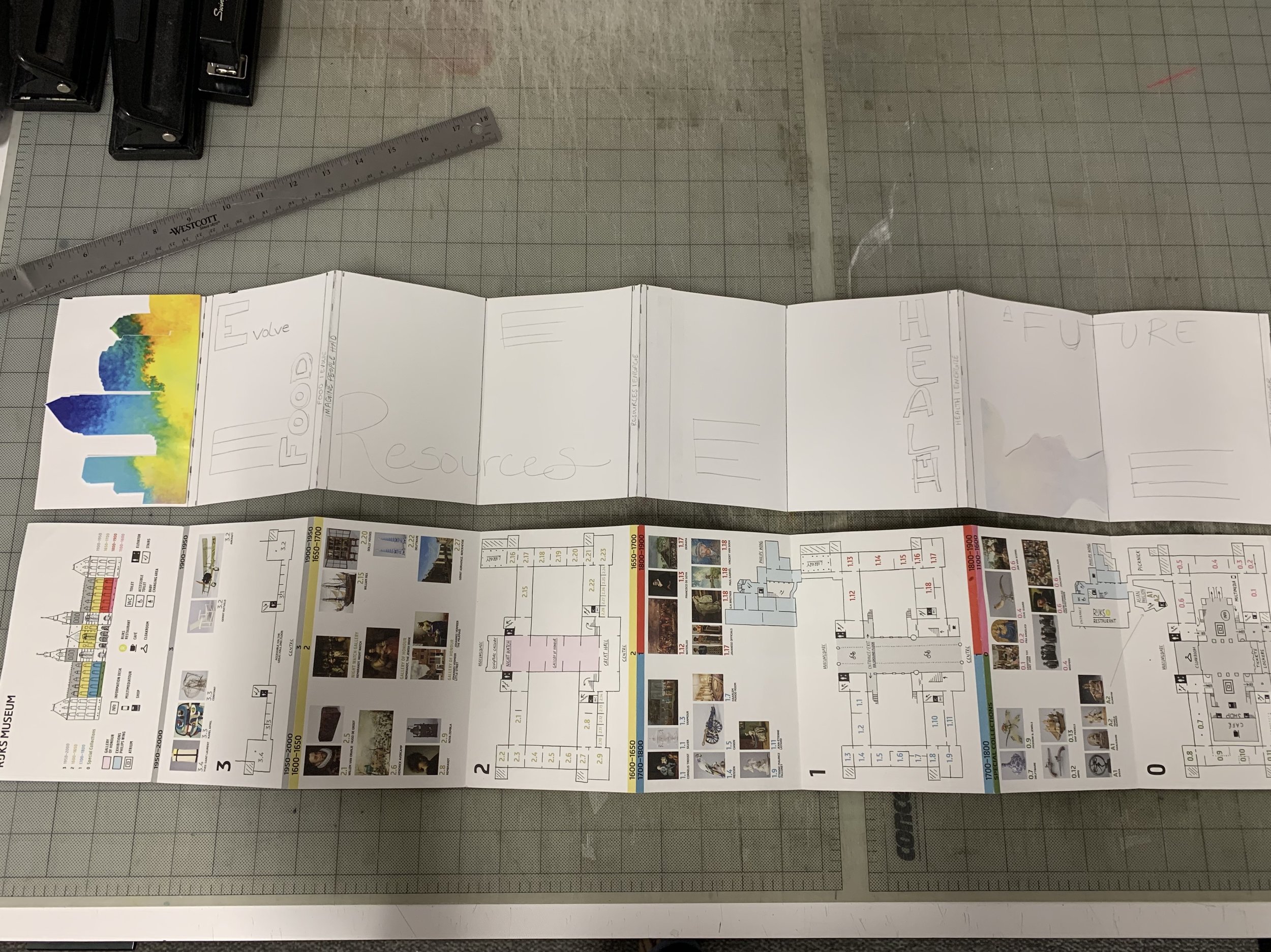
On a recent trip to Amsterdam, Tyler and I visited the Rijks Museum, where I picked up this super cool map. Individual stair step tabs revealed an illustration of each floor of the museum and displayed the historical artifacts or specific artists that were housed there. To be honest, it was a lot to take in in the moment. But I thought it was worth bringing back to the agency as an example of an inspiring layout.
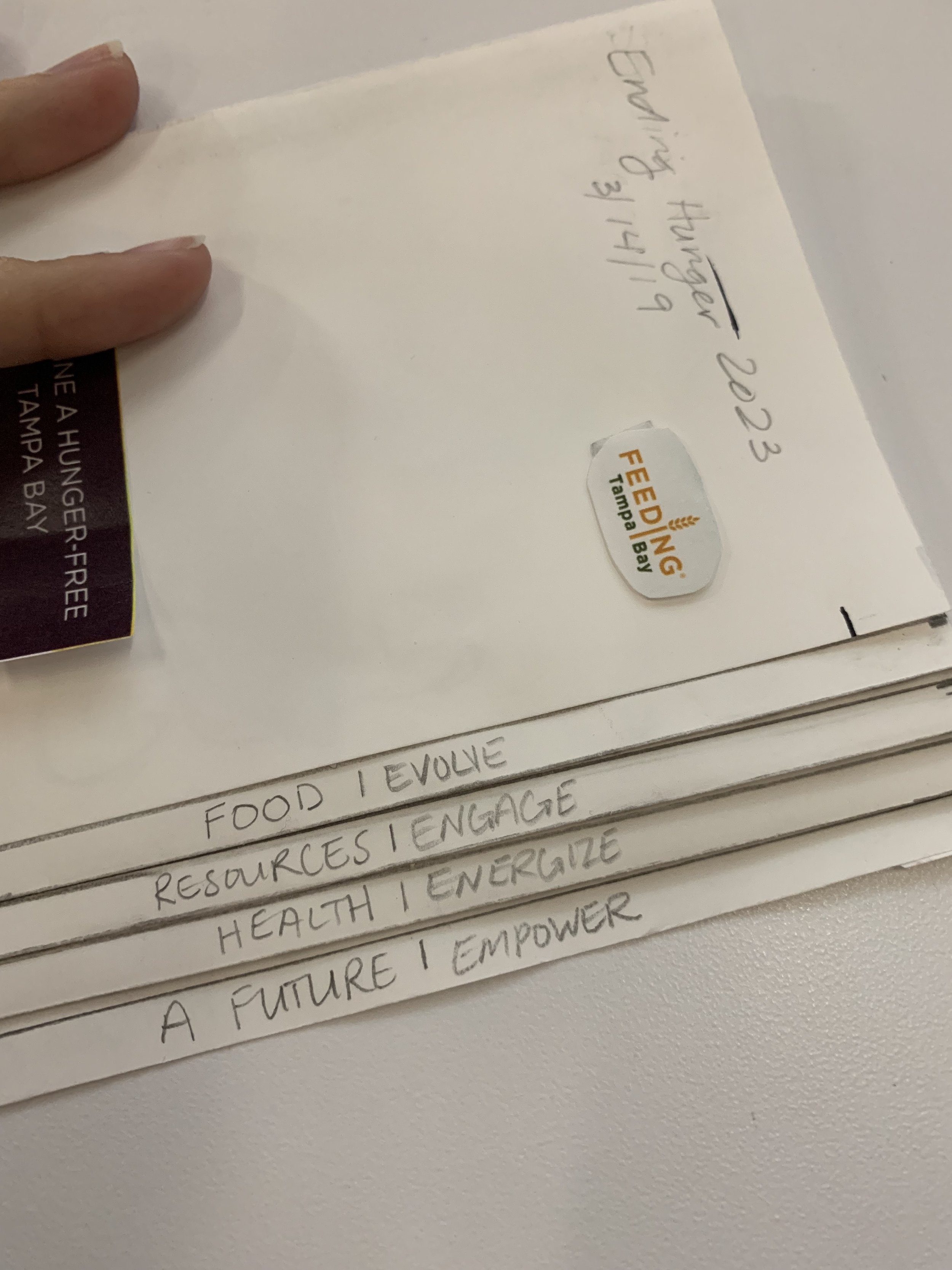
A few weeks later, our client, Feeding Tampa Bay, needed a physical representation of their strategic 5-year plan to hand out to Tampa Bay leaders at an upcoming media event. Suddenly, I had an idea of how to tell their story. With the help of a ruler, some tape, and many sheets of paper, I built a similar booklet to illustrate how this layout would be perfect to share Feeding Tampa Bay’s goal. Each strategic pillar would have its own space to shine, but when the booklet was fully opened, you could see how each piece of the plan worked together to create a hunger-free Tampa Bay.
Check out the making-of photos below, and see the finished project here.


